"Galz wif a$$e$ like mine don't talk 2 boiz wif face$ like yours" - quoted from "She's The Man"

Saturday, December 16, 2006

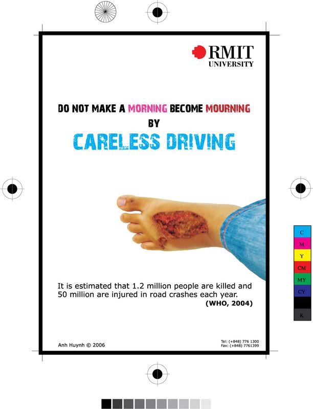
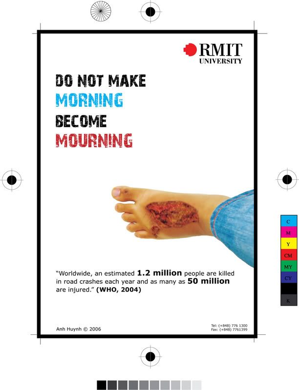
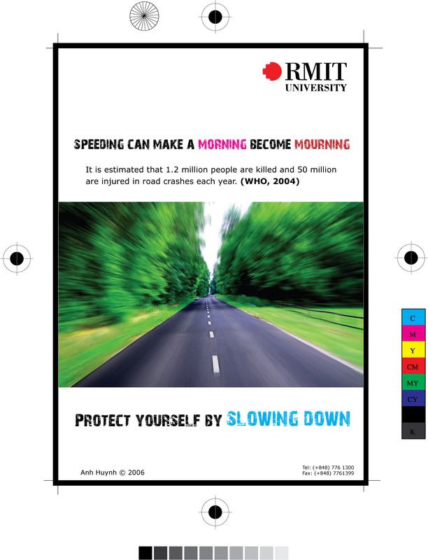
Another social welfare poster

This poster is made for fun; since the picture is not taken by me, as well as the photoshop affect :)) I just searched for some cool pics and this one is totally matched with my idea of anti-speeding poster. The message is also very clear "Protect yourself by Slowing down". As well, the statistic is easy to understand and linked closely to the image :) Also, the pun of "morning- mourning" is used again because both posters have the same theme :) Hope you like it!

My homepage ^^

Do you remeber the website layout designed by me of which the navigation is a set of colorful pencils? But it's the layout for other pages, because I want my homepage is something different but somehow related to other pages. One of my friends say that it's unneccessary to create an entry site like that, because he thinks that people tend to want something fast and simple. I agree with him; however, I think the entry site may make people more curious about what will be going on next :)
Since every page will has the main color of what it is defined on the nagivation, such as home is black, about is light blue, etc. Therefore the entry site must be something black and different from other sites; I thought of a monochromatic site :) then the design is a picture of me stuck on a stand. The whole composition is just black and white which may make people feel curious and weird.
This is my homepage:


To make you easier to compare, here is the layout of one of others:

Logo Sony Ericssion drawn by me :D

I always think that I sux at Illustrator, but after creating a social welfare poster, I wanted to try something new on Illustrator. So I chose the logo of Sony Ericssion to re-draw. The reason I picked that is the logo of Sony Ericssion appears everywhere, on the street, on the Internet, on my phone cover, etc. So I can easily look at this and re-draw.

Believe me or not, it's not hard at all when drawing things on Illustrator ;) I just made 4 layers for this logo. The 1st layer is the largest circle with radial gradient, while the 2nd smaller circle has an opposite radial gradient. The 3rd layer is the hardest one, I tried to draw by pen tool for several times then use the "Compound Path" option. Three little white cirles which are on the 4nd layer are the easiest thing to draw =]

Social Welfare Poster

Actually the inspiration that made me think of designing a poster of safe driving was my wounded left foot :)) You know, I was crashly hit in a motorbike accident and my foot had been almost paralysed for several days. Then I thought if I created a poster, it must have been a poster appealing safe driving :)) For this poster, there were several ideas coming through my mind. However, I didn't want to go to sources of free loyalty images like I used to do for my previous stuff. Instead, I would take photos by myself. Therefore, the foot in the poster is mine and actually it looks extremely terrible like that for real :)) After that, it was "photoshop-ed" to make it look clearer and brighter. The message of the poster is " Do not make a MORNING become MOURNING by CARELESS DRVING". It is a pun (morning- mourning) that I was taught when studying English in high school, so I hope it's interesting and more memorable for people. I also took a fascinating statistic of WHO in 2004 to illustrate what is on the poster.
This is the one I submitted:


And this is the early version which was usefully commented by Maddy, then I tried to make it better :))

Sunday, December 10, 2006

High-Contrast Sketch in Photoshop


I took this tutorial on http://www.tutorialized.com and I think it is cool for me to play different things flexibly. So I introduced you guys this and also some of my works applied by this tutorial ^^

Step 1: Duplicate the original image layer

Step 2: Change the duplicate layer's blending mode to Overlay.

Step 3: Reduce the Overlay 1 layer's opacity to 60%.

Step 4: Apply Filter > Stylize > Find Edges to the Overlay 1 layer.

Step 5: Duplicate the Overlay 1 layer.

Step 6: Apply Filter > Stylize > Find Edges to the Overlay 2 layer.

Step 7: Repeat step 5 and 6.

These two are taken and then changed into sketch by me. The second one is also applied the Gaussian Blur to make it more artistic and dreamlike.


See things in Black and White


Colors, of course, has its own important role in photography, but shades of grey can give our photos a classic and timeless feel. The emphasis on colorful image is easy to understand since it's how we see the world. However, a black and white photo can create more profound lighting and more dramatic shapes. Moreover, the objects needed to stress will not be distracted by other colors.


This picture was taken by me for months. Actually it is not a good color image due to its dull colors and the lack of lighting. After changing it into monochrome and playing with the Dodge tool in Photoshop, though it is just black and white, the picture becomes more sombre and attractive to look.


I took this picture for months ago. If you can see the original colorful one, it is full of inappropriate colors which may ruin the whole image. Converting it to a black and white picture helps to stop the clashing colors as well as create a charming mood. I also added some effects in Photoshop to make it clearer and brighter. In this image, contrast, shapes and shadows are employed as effects to make the image more classic and artistic.

2 color graphics


2 color design is a way to be creative interestingly as well as to save money. As many design companies have to face a client's request to design on a small budget, the resolution of making it in two colors or else is creative, powerful and economical. In other cases, it doesn't mean that the company has budget restriction, but it may be due to the age-old original style of that firm.


For example, in this United Airlines Hemispheres Magazine cover in December, two main colors are blue and brown. The white color serves as a minimal part to express the elegance as well as the color of snow and coldness of the winter.


This is Seagate Print Advertising. In this ad, black and mettalic spot green are used to be the main colors while the white background acts as the third color. The metallic color is employed to stress Seagate's corporate colors and build the illusion of depth.


This poster is designed for Ahmanson Theatre by Luba Lukova studio. It is easily seen that there are two main colors: red and black. Like the previous one that I introduced, the white background is the third color to emphasize the black shapes of the hand and the sword, as well as the red shapes of blood.
However, I think the typography kind of distracts the whole thing. The idea of using the script font is good but to me, the handwritten text like that makes the poster more messy and fussy.

Reference:
Templin Brink Design (2004), 2 color graphics, America, Rockport Publishers, Inc.

I took all of the pictures, so the quality is not so good. You can take a clearer look at the actual book in the library.