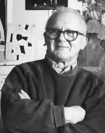
Paul Rand (born Peretz Rosenbaum, August 15th, 1914- November 26, 1996) was brought up in New York. He was educated at the Pratt Institute (1929-1932), the Parsons School of Design (1932-1933), and the Art Students League (1933-1934).
He had enormously influenced editorial design, advertising and corporate graphics for six decades. Initially, he began his career as an editorial designer for Apparel Arts magazines from 1935 to 1941. That was his first job in layout design that gave him a big chance to work as an Art Director of Esquire magazine at the age of 23, and other famous magazines, namely Ken, Coronet and Glass Packer. From 1938, he had become the cover designer for the cultural journal Direction. By the mid-1950s, he worked independently with emphasis on trademark and corporate design such as IBM, UPS, ABC, Cummins and Westinghouse, etc.
Paul Rand was not only an important figure in the field of graphics and visual communication, but also was a teacher, theorist and philosopher of design. His first book, Thoughts on Design, which was published in 1946, was a standard and a manifesto of Modernism. Other Rand’s significant books are Paul Rand: A Designer Art (1985), Design, Form, and Chaos (1993) and so on. Furthermore, he had written many terrific articles that referred closely to modern design, advertising, trademarks and visual arts. They are The Story of a Symbol (1949), and Modern Typography in the Modern World (1952), etc.
Throughout his lifetime on visual arts, he perfectly deserved gold medals from AIGA and the Art Directors Club of New York and also the honour of joining their Hall of Fame in 1972. Rand was also awarded several degrees of famous universities throughout the world: Yale University of Hartford, Parsons School of Design, Philadelphia College of Art, etc.
Now, we will take a look at three of his designs that I am impressed. The initial one is Rand’s first Direction cover (1940); the next is the AIGA cover/poster (1968) and lastly, the Eye, Bee, M poster (1981) will be analysed.
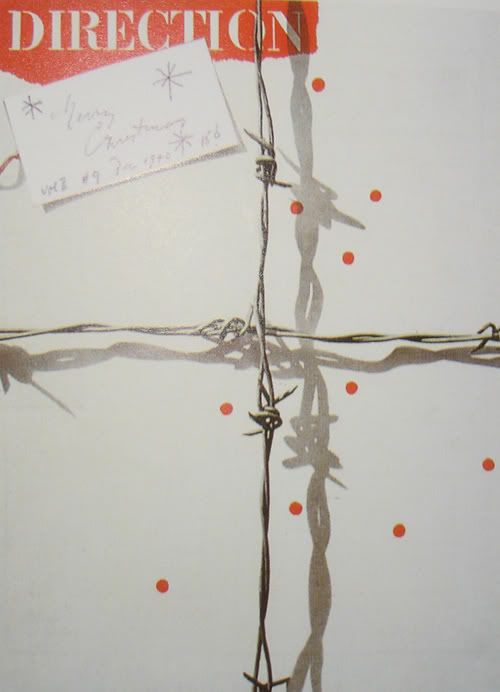
Direction Cover (1940)
 This cover, produced for Direction magazine, gives a persuasive demonstration of the role of visual and symbolic contrast in Rand’s designs.
 The composition looks like a Christmas package that is wrapped with barbed wire instead of ribbon. Besides that, the red circles that are randomly placed represent the drops of blood.
The handwritten wishes on a crisp rectangle tag contrast sharply with a torn-edged collage of the mechanical printed logo of the magazine. The contrast between texture, shape, typography and colour (red and white) between these two pieces of paper helps catch attention to a very specific point.
Moreover, the barbed wire and the Christmas tag are lit so that light shadows can give the illustration of three dimensions. In addition, two intersecting lines of barbed wire greatly manipulate the proportion and form of the design.
Rand’s use of white space seems to be clever and effective to create an emphasis on the dark black barbed wire and the red dots.
Typography plays an important role in this design through hand-made written font and mechanical stencil serif one. In this work, that is the dissimilarity in typography, which immediately draws attention by providing a visual distinction.
AIGA cover/poster (1968)

This poster is designed for the American Institute of Graphic Art in 1968. That is also a good example to prove precisely Rand’s ability to manipulate visual forms such as colour, shape, space, etc. Like in many of Rand’s works, this poster uses sensual visual contrasts to catch attention. By using two complementary colours that are red and green, Rand creates a huge contrast among the typography, the graphic shape and the green background, as well as makes these figures become closer to others. Moreover, he again takes advantage of the difference between shapes in the design. Playing organic form against geometric shape marks his work and also helps attract audiences’ awareness.
While his previous work I introduced uses shadow to indicate three dimensions, this composition plays with the overlapping which is one of the Gestalt theory. The overall piece of design appears to be quite flat; however, the overlapping of different forms and colours produces the three dimensions and also the illusion of a shallow space. What is more, it leads to the curiosity of viewers when there are some letters and coloured shapes hidden.
The mass of the main composition including the positive forms is balanced by the green background which plays as the negative space.
Unlike the combination of 2 different types of font in the Direction cover, his choice in this poster is a san-serif font. It works well and closely with other elements since its simple graphic typeface can make people pay more attention on the logo and the pun than a bunch of complicated serif or script fonts.
Eye, Bee, M poster (1981)
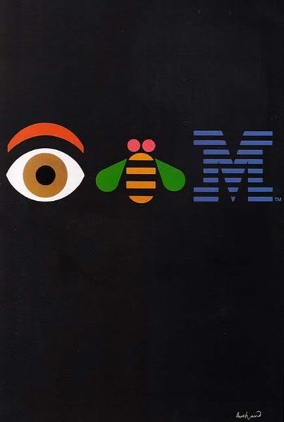
This poster, produced in 1981 is for an in-house IBM event, The Golden Circle Award and has become one of his most famous corporate identities.
Like his second design analyzed lately, this one again uses the flat and bright colours as well as pictographic symbols and signs such as the eye, the bee and the striped M letter as tools for depicting visual communications and messages to viewers. However, unlike the two previous ones, this design is two dimensional which is more suitable to characterize the logo of IBM Corporation.
The black background is employed as negative space to emphasize the pun of the logo: “Eye Bee M”. The tension between black background and other colours in the poster is sharpened by opposing a large area of black to a small area of other colours. Therefore, the symbols are more dominant, which is simple but extremely powerful to viewers.
In this design, Rand uses visual pun which is entertaining as well as informative to build such a clever and outstanding combination of images and typography. The actual eye and bee are brought to represent the letters and create a sense of humour. As a result, the design becomes more memorable and impressive.
The typography for the M letter is a geometric slab-serif typeface which is designed by George Trump in 1930. Later, Rand used it to develop the logo and then made it striped to suggest scan lines on computer screen. The appearance of the striped M letter will remind people of the striped colourful IBM logo.
In fact, by seizing upon montage and collage, Paul Rand brings the world of concepts, images, textures, colours and symbols into an organized and connected whole of design. Most of his works uses the visual contrasts between forms, colours, etc as well as the negative spaces to stress on the main design and make a remarkable impact on viewers. Typography also is employed successfully and effectively; the majority of them are simple but meaningful and appropriate within the designs.
To conclude, Laszlo Moholy-Nagy, a designer of the modern art and a master at the Bauhaus, portrays Rand’s style of design as "an idealist and a realist using the language of the poet and the businessman. He thinks in terms of need and function. He is able to analyze his problems, but his fantasy is boundless".
References:
Paul Rand, 2006, Wikipedia, http://en.wikipedia.org/wiki/Paul_Rand, viewed on 22nd November 2006
Paul Rand, 1999, American Icons, Area of Design, http://www.areaofdesign.com/americanicons/rand.htm, viewed on 22nd November 2006 (Originally published in Communication Arts March/April 1999)
Art, Design and Visual Thinking, http://char.txa.cornell.edu/, viewed on 22nd November 2006
Paul Rand Gallery, AIGA poster, Modernist Identity Design, http://students.philau.edu/KYLE2/gallery/index.html, viewed on 22nd November 2006
Paul Rand, Eye Bee M poster, 2006, Wikipedia, http://en.wikipedia.org/wiki/Image:Eye-Bee-M-Poster.jpg, viewed on 22nd November 2006
Tokar, Christopher, Paul Rand, Paul Rand’s image, http://www.sitographics.com/conceptos/temas/biografias/paulrand.html, viewed on 22nd November 2006
Heller, S. (1999), Paul Rand, New York, Phaidon Press Limited
Meggs, P.B (1998), A History of Graphic Design, 3rd edition, p.337-39, 368-69, New York, John Wiley & Sons, Inc
Hollis, R (2001), Graphic Design: A Concise History, p.102-03, New York, Thames & Hudson, Inc
Livingston, A. and Livingston I. (2006), The Thames and Hudson Dictionary of Graphic Design and Designers, new edition, p.182, New York, Thames & Hudson, Inc


