Saatchi & Saatchi website!!!
(click on the image to access this website)
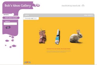
My friend introduced the website of Saatchi&Saatchi company which is often called The Ideas Company to me several months ago when I was studying semester 1. Immediately, the company which majors in interior design and advertising made a strong impression on me due to ts design and structure.
In term of its design, the first thing that makes me curious and eager is the solid block on the left of the page, it looks like a chimney reeking smokes. Especially, its source is the dropdown main menu of the company. It lets people think that the ideas from people working there can create new and innovative things based on available stuff. Moreover, from the top to the bottom, we can easily see many tiny and soft objects swimming around and around their given areas. On the top, there seems to be many shapeless ones escaping from the chimney and then swallowed by this solid stuff again. However, if you pay more attention on watching these funny things, you'll catch that there're not totally shapeless. Some of them has the shape of a rubber tyre, an airplane, a cat, a cooker, etc. In my opinion, they're the products that Saatchi&Saatchi advertised.
On the other hand, at the bottom of the solid block, there're a simulation of a fish tank. As you can follow, the above solid block named "Search" is moving based on the movement of the biggest fish which is at the highest point of "the fish tank". Everything is moving smoothly and peacefully. Actually, the color of things as well as the positions of all the fish will depend on which subjects you choose on the dropdown menu eg. "Our network"- grass green, "Kevin Roberts"- red, "Bob's Idea Gallery"- purple, etc. But to me, the sense of peace and tender doesn't change much ^^ hmmm... but it may get you bored if you concentrate on these things too much. However, above all, the most attractive thing can hold us to access this site and keep an eye on is the eyecatching movement as well as the outstanding colors of these small and simple things.
Second, as for the structure, I just can say "GREAT!!!".. you may agree with me, you may not... but I think it's well-organized and rather clear to view. Especially, the perfectly white background contributes to make the structure more stable due to its simplicity and clearness. Moreover, the content is divided reasonably and concisely. Each page's content is long enough to give sufficient information as well as not to let people feel bored.
I finish ^^ now it's time for you to explore Saatchi&Saatchi yourself!!!
posted by Alan Vo at 1:09 AM
|
0 comments
![]()
![]()

