"Galz wif a$$e$ like mine don't talk 2 boiz wif face$ like yours" - quoted from "She's The Man"

Saturday, August 26, 2006

-- Drawing on the Right Side of the Brain --


That's the name of a book that my friend, Lien Anh did introduce to me. I found it kind of interesting bc the title seems to be relatively impressive.

Book Description

Author: Dr. Betty Edwards is Professor Emeritus in Art at California State University in Long Beach.
Background of the book: When Drawing on the Right Side of the Brain was first published in 1979, it became the best seller of the New York Times for more than a year. In 1989, when she revised the book, it continued to hit New York Times's list again. Drawing on the Right Side of the Brain includes:
* the improvements in brain research;
* how to use drawing techniques in the world and in education;
* how to use your own self-expression through drawing;
* how to use colors correctly;
* how to use the five basic skills to solve the drawing problem.
Review: The Los Angeles Times states about this book: “Drawing on the Right Side of the Brain is not only a book about drawing, it is a book about living. This brilliant approach to the teaching of drawing . . . should not be dismissed as a mere text. It emancipates."

Maybe you get no idea or concept about the Right and Left brain. Let me tell you some.

Right Brain VS Left Brain

In short, the left brain is used to operate things that are logical, rational and use words to describe concepts, abstract, numbers and time. On the other hand, the right brain is much more sensitive to patterns, tends to be instinctive and illogical, and has no sense of time. Therefore, some first chapters of Drawing on the Right Side are spent to explain the left and right brain research, and why it is important and essential to drawing.

And now that's my review:

My Review:

First, I myself think from its beginning the book mainly aims for people who haven't tried their best to draw when they were children. However, if you are somehow good at drawing skills, you may or may not find this book useful. It depends.

Hmmm… the strong point that I found is that it teaches the readers a great amount of techniques and tricks to show how to really see and draw. For a beginner who has never tried drawing before, it is essensial to help them to draw in the right way. Many of the techniques in this book have actually been used by artists for centuries for example, the grid and the picture as well as teaching tools and concepts. The reason why many people gave this book 5 stars is that this was one of the first drawing books to simply tell readers to compare object 'a' to object 'b' and draw each in exact proportion to the other which is not detailed enough. Each chapter gives you more techniques and instructions on how to use classical drawing methods to set up your skills. This book isn't designed to teach you to be an artist but I think it can help you draw actually and find the pleasure in drawing.

Maybe i rank it 4.5 over 5 stars for its content and its helpfulness.

I recommend that people should read it once and feel the difference when reading other drawing books.

This book is now available on ILC of our university ^^ Have fun with it!!!

Thursday, August 24, 2006

Book Cover + + +


I spent 3 days on taking photos and designing it. The idea just came to me when I read the content of the book and I felt so sad though it seemed to be an imitated story.

At 1st, I tried to make one thing weird or at least different from the others, like Lien Anh did on her cover. But the image I took was extremely complicated =.= then I gave up this idea.

After that, I took a photo of a treepot in my garden and a wooden window of my neighbour's house and combined them together. The inspiration is that the window is a man's soul. He looks at the real life by a small space while the other ones are coved by his dark memory and the bittersweet alienation. However, only the small area that he looks at is kind of bright and fresh. That's because I wanted to create a hope, a vitality or maybe just a tiny happiness through his terrible and sorrowful life.

The sky background partly supports the idea of the window. Hopefully, it makes the space of the book outstretched and become hazy.
The way I choose the placement also makes me feel headache. 1stly, the book looked "tight" and didn't fit with the meaning of the sky background. Then after changing the placements many times, it looks better (hope so) and there are some negative spaces to balance with other positive spaces.
One of my friends think that my cover seems to be old and unfashionable... ^^ yes, it is but maybe that's what I tried to express. Though the story happens in modern-day in HCM city, the feeling of the main character is always toward the past and being romoted from the society.

One of the reviews is taken and put on the front cover because when you look at a book, the 1st thing that you stare at is the front cover, rite? ^^ A review put here makes people curious about this book since its comment and the window's image support each other. The review is aligned left as when it is, I feel that two different things i.e the image and the text seem to lean on each other and create a hard sense. That's just my feeling, you can think something else. +.=

hmmmm.... I just used some very simple skills of PS and Illustrator to make this cover because the fonts, the background and other stuff like those are what I really care more about ^^
Hey, don't throw potatoes and tomatos at me, huh? =)) Just view it and give me comment if it's not really negative... =)) tee-hee

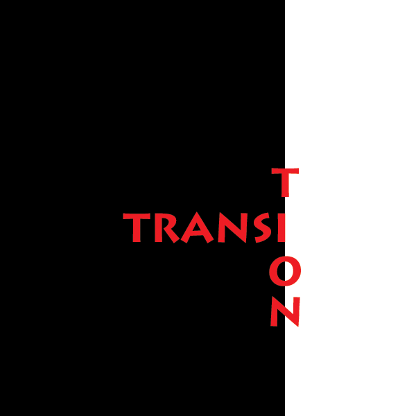
Word Project Test

I just put some plain stuff here, but it took me time to have a new idea and then develop this idea into computer work.

The 1st one is kind of easy to generate an idea and depict it by Photoshop ^^ Since I tend to use black and white shapes to represent 2 different things or to connect 2 different parts, this work is not an exception.


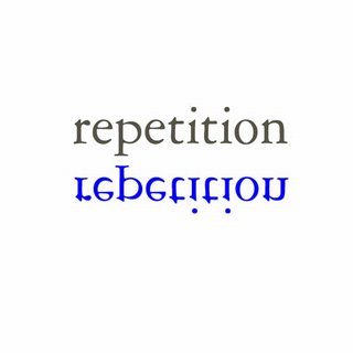
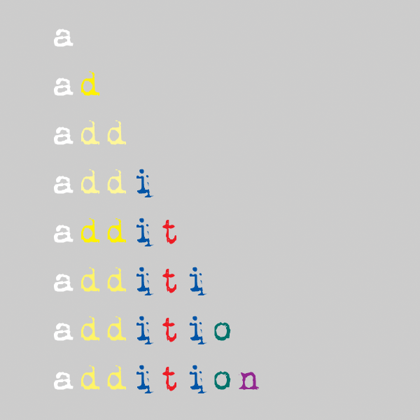
When making the 2nd one, I want to create something that repeats something else but it must have its own characteristics somehow. Therefore, the original word is grey and its duplication is blue.The 3rd one is kind of plain and usual, but hopefully its font and colors can make people feel more interesting. The idea is just a sudden inspirartion because I taught my brother Maths and then the word "addition" went along my mind. In my opinion, every letter has each own value, therefore various colors are used. Moreover, the same letters have the same color.


The last one is an image representing the word "compression". I just put create a compression between 3 words by putting them close to another and resize them a little bit.