"Galz wif a$$e$ like mine don't talk 2 boiz wif face$ like yours" - quoted from "She's The Man"

Wednesday, November 08, 2006

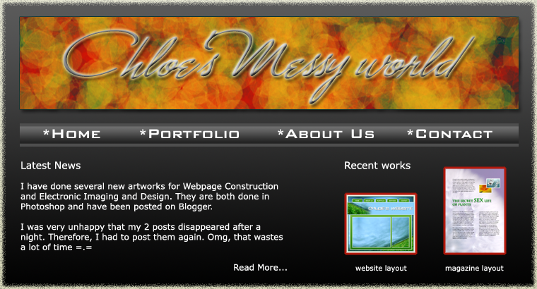
Another website layout :)

This is another website layout that I created for Webpage Construction course. Since the previous one is kind of dark and sad, I wanna try something new and happier. You know, paper and pencils or color pencils are essential things for designers. For example, I always bring my beloved pencils and a wad of paper to sketch my ideas whenever I want.

Since this website is designed for me, I wanna create a website that when ppl look, they will think thatz a website of a designer ^^ (hope so)
I also use only 1 font, thatz Vernada as I wanna try something classical but new to me. However, I adjust its sizes and colors to fit wherever I put it. So it doesn't look plain at all.


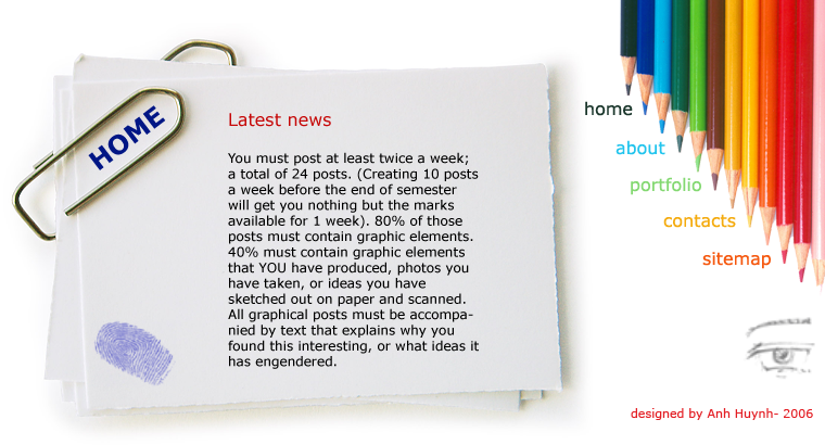
http://unix.rmit.edu.vn/~s3131319/layout_sketch.html

Thatz the link if you guys wanna see it more clearly.

Sunday, November 05, 2006

~Web Layout~

Thatz the web layout which is designed by me for Website Construction course ^^ I used brushes to make the leaves and blending option for the header. It took me about more than 1 hours to complete the whole thing.
Hmmm... I do love the background of the banner because of its colours and shape. Actually, I juz played some stuff with the Hue/Saturation option and the Brushes, but the result is fairly cool ^^
ENJOY IT!!!


And that one is the 2nd version since one of my friends wanna see it when it has some texts and other pictures. Here it goes:

==Playing with Photoshop==

I was very unhappy when knowing that my 2 posts disappeared after a night. So I created an image to express my feeling. It was made in Photoshop. It didn't take me so much time to complete it, but it was hard to find the suitable brushes! Just enjoy it yourself ^^
There are 2 versions:


Gestalt Exercise


So sorry that this post also has gone after a night and the reason is still a mystery =.= I had to post it again *


For this exercise, I has several ideas... Some are totally different, some are created based on the same idea.
This is the one I created in class so the idea is kind of simple. It is, to me, applied 2 Gestalt theory that are Continuance and Proximity.


The Continuance concept is used when the title is placed between the main content. That may lead the readers to look at the title and read the whole article. I also put 2 small images of plants to illustrate the content of the article. It seems to be a mix-up between Proximity and Closure because one of them misses a part of its body, however the other overlaps it =.=

After taking a nap, I had some different ideas so I created 2 versions of it.

The 1st one is based on the Proximity and Closure concept. Many circles with various sizes and colors may make it become a 3D picture due to its lumnance, texture and contrast. The real image of a orange flower is hidden, which may cause a curiosity in viewers. Circle with missing parts is a type of Closure and the overlapping is based on Proximity concept. What is more, I guess the last white line above the title is a kind of Continuance comcept, but I'm so sure.


The 2nd version is kind of plain as I juz changed it a little bit from the 1st one. It's also created on the Proximity and Closure concept.

Sun and Moon symbol part 1


I don't know why yesterday I published 2 posts on my blog, but now they've gone =.= I have to post them again, so it's much shorter and simpler (cuz the passion has already gone after a night *sigh*)


The Sun symbol is created due to what I researched and have experienced in life. The center circle has 2 different colors: red and yellow. To me, the Sun is not only the resource of subsistence (the yelow part), but also can destroy things on the Earth (the red part). When carefully looking at it, you may see the face of 2 people, one is red and one is yellow. They seem to argue with each other. Actually, I didn't mean that when drawing this symbol, but after rendering, I found this interesting thing. Hmmm... what is more, after studying the Gestalt theory, I guess it's Closure concept ^^


The Moon has 2 colors: black and light yellow. The black parts represent the dark nights and the yellow ones can make people think of the tender and comfortable moonlights. The black half circle symbolizes the half moon, which is appiled the Closure concept again. Besides that, the moonlights with different sizes and colors may be the Similarity concept.