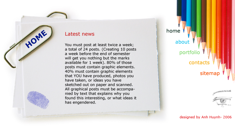
Another website layout :)
This is another website layout that I created for Webpage Construction course. Since the previous one is kind of dark and sad, I wanna try something new and happier. You know, paper and pencils or color pencils are essential things for designers. For example, I always bring my beloved pencils and a wad of paper to sketch my ideas whenever I want.
Since this website is designed for me, I wanna create a website that when ppl look, they will think thatz a website of a designer ^^ (hope so)
I also use only 1 font, thatz Vernada as I wanna try something classical but new to me. However, I adjust its sizes and colors to fit wherever I put it. So it doesn't look plain at all.
http://unix.rmit.edu.vn/~s3131319/layout_sketch.html
Thatz the link if you guys wanna see it more clearly.
posted by Alan Vo at 4:43 PM
![]()
![]()


3 Comments:
colorful and simple but it's not plain. u use all the space. I think you should change the font into something like a hand-writing...maybe . but i think it looks good now :)
Friday, November 10, 2006 8:20:00 AM
Well I like ur creativity when u put the navigation part on the right. it's unconventional and impressive =] the overall look is quite clean and well-seperated. Those color pencils actually act like pointers to the text so that's the bit which catches my attention first.=]
Friday, November 10, 2006 9:14:00 AM
I like this - it's clean and neat - but a little gimicky.
Tuesday, November 28, 2006 11:31:00 AM
Post a Comment
<< Home