"Galz wif a$$e$ like mine don't talk 2 boiz wif face$ like yours" - quoted from "She's The Man"

Saturday, January 13, 2007

"Hard Candy" movie

Hard Candy (2005)

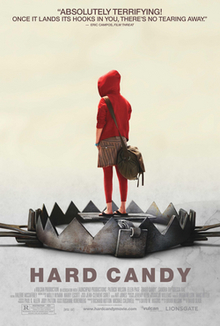
Directed by David Slade
Cast: Patrick Wilson, Ellen Page, Sandra Oh, Odessa Rae...


I've just seen this film several hours ago ^^ At 1st, that is an extremely weird film to me. However, at the end of the film, I just can say "What an excellent movie!".

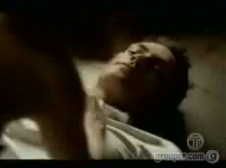
The title comes from a lang in the Internet to indicate under-aged girls. The movie is about a 14-year-old girl named Haley meeting an online guy in a local coffee shop after chatting with him for 2 weeks. Then she suggests that they can go back to his house to talk and drink. Suspecting that he is a pedophile, she anaesthetized him and searched the house to find the proof that he is a sexual predator. What is going on next, I think it'd better for you to find out yourself because you won't know exactly the truth is until the end.


In my opinion, the casting is incredible and breaktaking. Patrick Wilson plays the role of Jeff sensationally and innocently at the very first moment of the film. Most the characters of his films that I've ever seen fall into the type of handsome, talented, rich, innocent and brave man who is always towards his girl. However, in this film, he makes me very surprise with the figure of the pedophile who usually fools under-aged girls into sleeping with him and tells lie a lot. His performance is really realistic and convincing. Besides that, the role of Ellen Page is beyond my thinking. She acts as if she was Hayley Stark. Her anger, revenge, crudity, ruthlessness, etc attracts people's attention everytime she's on the screen and builds a revolting piece of work. I like the way she delivers a mind-blowing and amazing performance.
You should watch this film at least once. I am sure that will make you freaked out but also hooked up to the sreen. Some scenes can as well scares me stiffffff :|

Thursday, January 11, 2007

Pictures I took in a restaurant


These are pictures that I took when going out for dinner with my family. The restaurant I went in is built upon the style of Hue, that was used to where the loyal family lived.


The 1st one is an image of a vessel of tulip flowers on the table. They are real flowers, and I think these are amazingly gorgeous and mysterious in the picture. The shapes, the colors and the contrast are extremely in harmony. The lighting on the wall makes viewers concentrate more on the flowers and their beautiful shapes.


I also post another pic of the same vessel of flowers. However, in this pic, when added some lighting effects and flash, the pic looks much more simple and usual. In my opinion, it might not create an interesting feeling for viewers that much. In addtion, these flowers look unrealistic and weird, at least to me.


The second pic that I took is the one of three decorative lanterns. I think the tough contrast between the light of those lanterns and the dark background contributes a lot to the pic. Besides that, though the background is kind of messy, it helps to emphasize the lanterns' strong lighting and their traditional forms.


As well, the last one focuses on the contrast between the target and the background. I like these beautiful and similar patterns of the lamp's lighting. Besides that, I think the extremely dark surroundings help a lot to stress the lamp and its loneliness.

Saturday, January 06, 2007

"Copy to Grid" effect in Flash

I don't know whether people already know it or not. I wanna share this hint with you guys because I think it might be useful more or less.

Ok, when you have a project that requires a bunch of the same objects that are placed neatly in a grid. What do you do? Duplicate it and put them piece by piece, huh? Well, it's Ok, but it wastes a lot of time as well as all of the copies might not be placed exactly vertically or horizontally.

So there is a smart solution that Flash provides for us: the "Copy to Grid" effect.

STEP 1: Import to stage a small picture, then set it on the top left of the frame.

STEP 2: Keep selecting the image, choose Insert --> Timeline Effects --> Assistants --> Copy to Grid.

STEP 3: In Copy to Grid window, set the options due to what you need.


It is surely a simple tip that I show, but it's kind of useful, isn't it? ;)

"Motion Graphics: How did they do that?" by David Greene

I recommend you guys the book "Motion Graphics: How did they do that?" written by David Greene. I borrowed this yesterday and found there is something extremely useful for me.

Due to what I've been reading so far, this book is a huge collection of extremely great motion graphics, from broadcast to new media, in the world of advertising, film, Internet and so on. This also gives us a clear look at the visual communication techniques that designers use to create valuable messages underlying their pieces of work. In this book, the firms and projects will be presented and analysed in term of project overview, creative process, production, tools, and etc. These will really help understand the artworks these designers have done as well as the process they've experienced.

random pictures

These are some pictures that I took when I was going out with my friends in the countryside. All of image were taken by my cellphone so the quality is not so good. However, I used Photoshop to edit them a little bit, so they look brighter and clearer.

The 1st one is the sight of a garden overgrown with weeds in the afternoon. I don't know the name of the weeds, but I like this kind of weeds a lot. They looks distinct and somehow lonely in the picture.


I was lying on the grass when taking this picture. The angle of shooting might attract people's awareness firstly. Moreover, its lightning, contrast, color, rhythm and alignment might create a dreamlike mood for viewers. That's also the one I like most.


This one was taken randomly when I was moving my cellphone above my head, but the quality is very good. In my opinion, that is the un-centered arragement which may help catch the viewers' attention. Besides that, the main color, green, builds a fresh and comfortable feeling for audiences.


This one may catch people's attention due to its "sun spot". Actually there were a sun spot as well as several sun lights across the tress, which was extremely stunning. However, I think my cellphone was not good enough to take this kind of sight, so what we can see now is just a small spot of the sun.

Saturday, December 30, 2006

Why Sex Before Marriage?

(click on the image to view the ad)

This is a humorous piece of advertising of a mobile company :)) It is a combination of humour, romance, sex and shock :)) I have no idea why they choose this topic to appeal people to use their mobile phone; but maybe because their message which is "Think before committing" reflects the content of the ad. Watever, that's a funny and surprising ad to look at :))

I like the soundtrack because it's one of my fav. songs ever, also I think it can double the surprise at the end of the ad and create an extreme shock for viewers.

Hope you guys like it ^^

Digital Star Effect

The tutorial is on http://photoshoptutorials.ws/
It helps to turn a regular photo into a high-tech digital artwork. It is suitable to make a twinkling screen saver or a strange but cool header of a website. I think it is kind of easy for everyone who has some skills in Photoshop because it is just done by combining several filters.
I have done sereval works due to this tutorial, I also change some effects to fix what I want.
Here are my works:

Music Player created by me :D

(click on the image to view the flash)

This is another piece of work I've done in Flash ^^ It's an old piece, you know. I did it in semester 2, but it was not complete. And now, it's complete :D

It is kind of a music player :D since the features are not so strong, just "play", "stop", "pause", etc. I drew the background in Illustrator and then used brush in Photoshop to make it more abstract! The code for the music player is not so hard, but I had to grope around a lot before finishing it!

I think you should try the size of 480 x 360 because I made it fairly small in flash.

Assignment 2C


(click on the image to watch the flash)-- the graphics is slower than the music because of the net :| watever, hope ya enjoy it :|

This is my work on Flash which is an ads of Serifa. Serifa is a slab-serif font created by Adrian Frutiger in 1964. It is based on his earlier sans serif design, Univers. Then Square, unbracketed serifs have been added. It is usually difficult to read slab serif typefaces in text, but Serifa is readable for both text and display applications such as headlines, captions, or corporate logos.

For this flash, I use red and white color as the main theme since I want to create something strong and modern. The background is a gradient which may make it more interesting and modern. As well, some line effects that I add on the background do very good work as an interesting and lively effect. The music is taken from Free Play Music, I have tried 2 songs, which are 2 different kinds of music, for my flash. It is an experiment as I want to create 2 moods for viewers: one is eagerness and excitement, one is peacefulness and comfortableness. The 1st mood is created when they are looking at the show of Serifa, the 2nd is staged when the menu appears.

Saturday, December 23, 2006

Old Effect in flash


Some guys looked at my flash and they wondered how I could create the old effect for my flash. Actually it is not really the old effect, but the effect of making different lines crossing randomly throughout your flash. You can apply many style of crossing line to make your piece of flash more interesting. This effect is taken from http://www.tutorialized.com.

Step 1: Create a new flash document, and set frame rate to 40fps.

Step 2:
Use the Pencil Tool (Y) and set the Stroke Height 1px and choose Solid.

Step 3: Open the Color Mixer Panel, for Stroke Color choose white and set alpha to 18%.

Step 4: After that, on frame 1, draw a lot lines with different size, click on some lines and set its Stroke Color to white.

Step 5: Click on frame 2, and delete the lines that you just have created. After that create a new lines, different sizes and locations.

Step 6: Repeat this steps about 20 times. Insert your picture as a background and see how it works.


How to create aqua button :D

This tutorial is taken from http://www.tutorialized.com, and I think this is kind of useful if you want to create something like this for your flash or web stuff.

Step 1: Create a new folder.

Step 2: Select ‘Elliptical Marquee Tool’ to draw a circle.

Step 3: Choose ‘Rectangular Marquee Tool’ to draw a rectangle from middle of the circle.

Step 4: Apply the ‘Elliptical Marquee Tool’ again to draw another circle.

Step 5: Create a new layer with the color #9BF2FF as foreground color. The background is white. Apply "Gradiant Tool".

Step 6: Apply blending option for the button. Choose stroke and select #7BA6AC color and stroke width 1.

Step 7: Select the layer1 and create a new layer and then select the box ‘group with previous layer’. Keep the selection active.

Step 8: Move the layer2 above the layer1.

Step 9: Use ‘Gradiant tool' and apply foreground to transparent fill style and fill the selection to the lower portion of the selection. The foreground color is white. Adjust the white shade to have the color you want. And now you have the aqua button.

"The Butterfly effect" review

I've just watched this film several hours ago and I was extremely touched. There are a number of compliments as well as criticism for this film. However, in my opnion, it is worth watching due to its non-linear structure and brilliant performance.

The Butterfly effect (2004)

Written and Directed by Eric Bress J. Mackye Gruber
Cast: Ashton Kutcher, Amy Smart, Kevin Schmidt, Melora Walters, Elden Henson, Eric Stoltz...

Since I have watched many non-linear movies like this, I was not so surprised when watching this film. But it gives me a very strange feeling: depressed, sad, chaotic, haunting and empty. It is one of those movies that just catch your eye and at the beginning, you might think "Ok, this is strange, I want to watch something else" but as long as it goes on, it turns to be harder and harder to look away from the screen.

When a kid, Evan Treborn suffered his sickness of losing some parts of his memory. There were a lot of things that happened to him: being abused in the house of 2 best friends, nearly killed by his father, and so on. So when he moved town with his mother, Evan's memories seemed to be much better, he had not lost memory for 7 years. At the age of twenty, however, Evan finds that reading entries from his childhood journals can help him to transport himself back to those forgotten memories, and can even change them before returning to the present. Evan tries to 'fix' things in his past so that he and his old best friends can have happier lives. However, he soon learns that even the tiniest change of the past can lead to greatly unpredictable consequences for the present. That is the meaning of "the butterfly effect"- only one slight thing in the past can change the whole world in the future.

In the very end of the film, Evan returns to the first time he met Kayleigh and ignores her to make her hate him. That is because he wants to protect her from being hurt or sorrowful when besides Evan. Years after years, they both become successful people, pass each other on the street, but keep on walking. I like the end since it brings audiences to an uncomplete feeling and makes them think of the film for a while.

The movie has a special and interesting story on psychology. As well as it plays on the theory of Butterfly Effect which is stated in the very beginning of the movie "If a butterfly flaps its wings on one side of the world, the ripple effect could cause a tempest on the other". The sound is also great, it makes me freak out all the time. As the main theme is dramatic, the sound of him blacking out turns to be dynamites exploding. The casting is extremely good, I think that is the best film ever Ashton Kutcher has acted. Amy Smart plays versatilely and cleverly when turning to be different characteristics in the future: a college girl, a service girl, a prostitute, etc. Every figure that she plays has its own soul and inner feeling. Besides that, it surely has full of inappropriate languages, but most of the films today do. And behind these dirty languages, there are a chaotic and real life expecting and happening everyday in the world.

Saturday, December 16, 2006

Another social welfare poster

This poster is made for fun; since the picture is not taken by me, as well as the photoshop affect :)) I just searched for some cool pics and this one is totally matched with my idea of anti-speeding poster. The message is also very clear "Protect yourself by Slowing down". As well, the statistic is easy to understand and linked closely to the image :) Also, the pun of "morning- mourning" is used again because both posters have the same theme :) Hope you like it!

My homepage ^^

Do you remeber the website layout designed by me of which the navigation is a set of colorful pencils? But it's the layout for other pages, because I want my homepage is something different but somehow related to other pages. One of my friends say that it's unneccessary to create an entry site like that, because he thinks that people tend to want something fast and simple. I agree with him; however, I think the entry site may make people more curious about what will be going on next :)
Since every page will has the main color of what it is defined on the nagivation, such as home is black, about is light blue, etc. Therefore the entry site must be something black and different from other sites; I thought of a monochromatic site :) then the design is a picture of me stuck on a stand. The whole composition is just black and white which may make people feel curious and weird.
This is my homepage:


To make you easier to compare, here is the layout of one of others:

Logo Sony Ericssion drawn by me :D

I always think that I sux at Illustrator, but after creating a social welfare poster, I wanted to try something new on Illustrator. So I chose the logo of Sony Ericssion to re-draw. The reason I picked that is the logo of Sony Ericssion appears everywhere, on the street, on the Internet, on my phone cover, etc. So I can easily look at this and re-draw.

Believe me or not, it's not hard at all when drawing things on Illustrator ;) I just made 4 layers for this logo. The 1st layer is the largest circle with radial gradient, while the 2nd smaller circle has an opposite radial gradient. The 3rd layer is the hardest one, I tried to draw by pen tool for several times then use the "Compound Path" option. Three little white cirles which are on the 4nd layer are the easiest thing to draw =]

Social Welfare Poster

Actually the inspiration that made me think of designing a poster of safe driving was my wounded left foot :)) You know, I was crashly hit in a motorbike accident and my foot had been almost paralysed for several days. Then I thought if I created a poster, it must have been a poster appealing safe driving :)) For this poster, there were several ideas coming through my mind. However, I didn't want to go to sources of free loyalty images like I used to do for my previous stuff. Instead, I would take photos by myself. Therefore, the foot in the poster is mine and actually it looks extremely terrible like that for real :)) After that, it was "photoshop-ed" to make it look clearer and brighter. The message of the poster is " Do not make a MORNING become MOURNING by CARELESS DRVING". It is a pun (morning- mourning) that I was taught when studying English in high school, so I hope it's interesting and more memorable for people. I also took a fascinating statistic of WHO in 2004 to illustrate what is on the poster.
This is the one I submitted:


And this is the early version which was usefully commented by Maddy, then I tried to make it better :))

Sunday, December 10, 2006

High-Contrast Sketch in Photoshop


I took this tutorial on http://www.tutorialized.com and I think it is cool for me to play different things flexibly. So I introduced you guys this and also some of my works applied by this tutorial ^^

Step 1: Duplicate the original image layer

Step 2: Change the duplicate layer's blending mode to Overlay.

Step 3: Reduce the Overlay 1 layer's opacity to 60%.

Step 4: Apply Filter > Stylize > Find Edges to the Overlay 1 layer.

Step 5: Duplicate the Overlay 1 layer.

Step 6: Apply Filter > Stylize > Find Edges to the Overlay 2 layer.

Step 7: Repeat step 5 and 6.

These two are taken and then changed into sketch by me. The second one is also applied the Gaussian Blur to make it more artistic and dreamlike.


See things in Black and White


Colors, of course, has its own important role in photography, but shades of grey can give our photos a classic and timeless feel. The emphasis on colorful image is easy to understand since it's how we see the world. However, a black and white photo can create more profound lighting and more dramatic shapes. Moreover, the objects needed to stress will not be distracted by other colors.


This picture was taken by me for months. Actually it is not a good color image due to its dull colors and the lack of lighting. After changing it into monochrome and playing with the Dodge tool in Photoshop, though it is just black and white, the picture becomes more sombre and attractive to look.


I took this picture for months ago. If you can see the original colorful one, it is full of inappropriate colors which may ruin the whole image. Converting it to a black and white picture helps to stop the clashing colors as well as create a charming mood. I also added some effects in Photoshop to make it clearer and brighter. In this image, contrast, shapes and shadows are employed as effects to make the image more classic and artistic.

2 color graphics


2 color design is a way to be creative interestingly as well as to save money. As many design companies have to face a client's request to design on a small budget, the resolution of making it in two colors or else is creative, powerful and economical. In other cases, it doesn't mean that the company has budget restriction, but it may be due to the age-old original style of that firm.


For example, in this United Airlines Hemispheres Magazine cover in December, two main colors are blue and brown. The white color serves as a minimal part to express the elegance as well as the color of snow and coldness of the winter.


This is Seagate Print Advertising. In this ad, black and mettalic spot green are used to be the main colors while the white background acts as the third color. The metallic color is employed to stress Seagate's corporate colors and build the illusion of depth.


This poster is designed for Ahmanson Theatre by Luba Lukova studio. It is easily seen that there are two main colors: red and black. Like the previous one that I introduced, the white background is the third color to emphasize the black shapes of the hand and the sword, as well as the red shapes of blood.
However, I think the typography kind of distracts the whole thing. The idea of using the script font is good but to me, the handwritten text like that makes the poster more messy and fussy.

Reference:
Templin Brink Design (2004), 2 color graphics, America, Rockport Publishers, Inc.

I took all of the pictures, so the quality is not so good. You can take a clearer look at the actual book in the library.