"Galz wif a$$e$ like mine don't talk 2 boiz wif face$ like yours" - quoted from "She's The Man"

Saturday, December 09, 2006

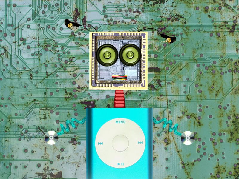
Self-portrairt as a Machine

This is my self-portrait as a machine. I use Photoshop CS 2 to assemble and complete the whole thing. Since everyday listening to music becomes part of my life, I want to create a machine that can be used to listen to music and its look must be funny. A part of an iPod is employed to be my body while other parts are electronic devices and chips. A pair of loudspeakers are my eyes; they both make my face look funny and naive =] A piece of electric wire is used to be my mouth =] I will not describe other parts of my body, which are kind of easy to recognize. The background is an overlay between 2 different backgrounds, one is rusty while another is an electronic chip.


Sunday, December 03, 2006

Social Welfare Posters in Ho Chi Minh

As Maddy wanted us to take photos of social welfare posters that we catched on the street, I took several pix while hanging out with my Mom.


I took this poster on Nguyen Thi Minh Khai street. It encourages HIV people to meet Free Health Consultative Service and get advices from the consultants. The message of the poster is "When advising, we're the professions. When talking, we're your best friends".


That is the same style of poster but for men.


This one was taken on a street in district 6. The text is "Stable population, Well-off country and Happy family" which is really weird to translate into English =] I really don't know what is the actual message that they want to communicate with people. However, the picture is nice with sharp shapes and bright colours.


This poster is produced to call upon the people to comply with fire regulations. The text is "Prevent fire is necessary to protect ourself" (actually I don't translate it word by word; if so, it sounds silly and funny =] ) I think the graphic is quite nice and neat but the message and the idea are not strong and impressive enough to make people pay attention and memorize it ^^


The last one I took appeals for safe driving and is kind of funny =] The graphic is fun and clear, the colours are flat, but in my opinion, the message is not strong ("Safe driving is the happiness for all"- it sounds kind of weird when translated into English, huh?) Actually it doesn't make people consider why they should worry about fast and careless driving when seeing such a very happy face with a very modern motorbike =]

One of the similar things that Vietnam posters meet is the font, the designers always use the bold, uppercase serif fonts. I don't think they work well in these posters, but somehow catch viewers' attention. Next, the graphics are all nice and clean, but the colours are not connected and strong enough to express the message. Lastly, the mesage is not impressive or strong to attract people's attention and let them memorize it. It always is plain and common ^^