Layout print exercise >"<
Actually, I didnt know whether I had done it right or wrong just because I couldn't read the file attached on BB. Therefore, what I did was what I heard from some friends and guessed from the rest of the slices.
There's something wrong with PC's resolution, therefore, you need to click to each card to view the precise sizes and colors ^^
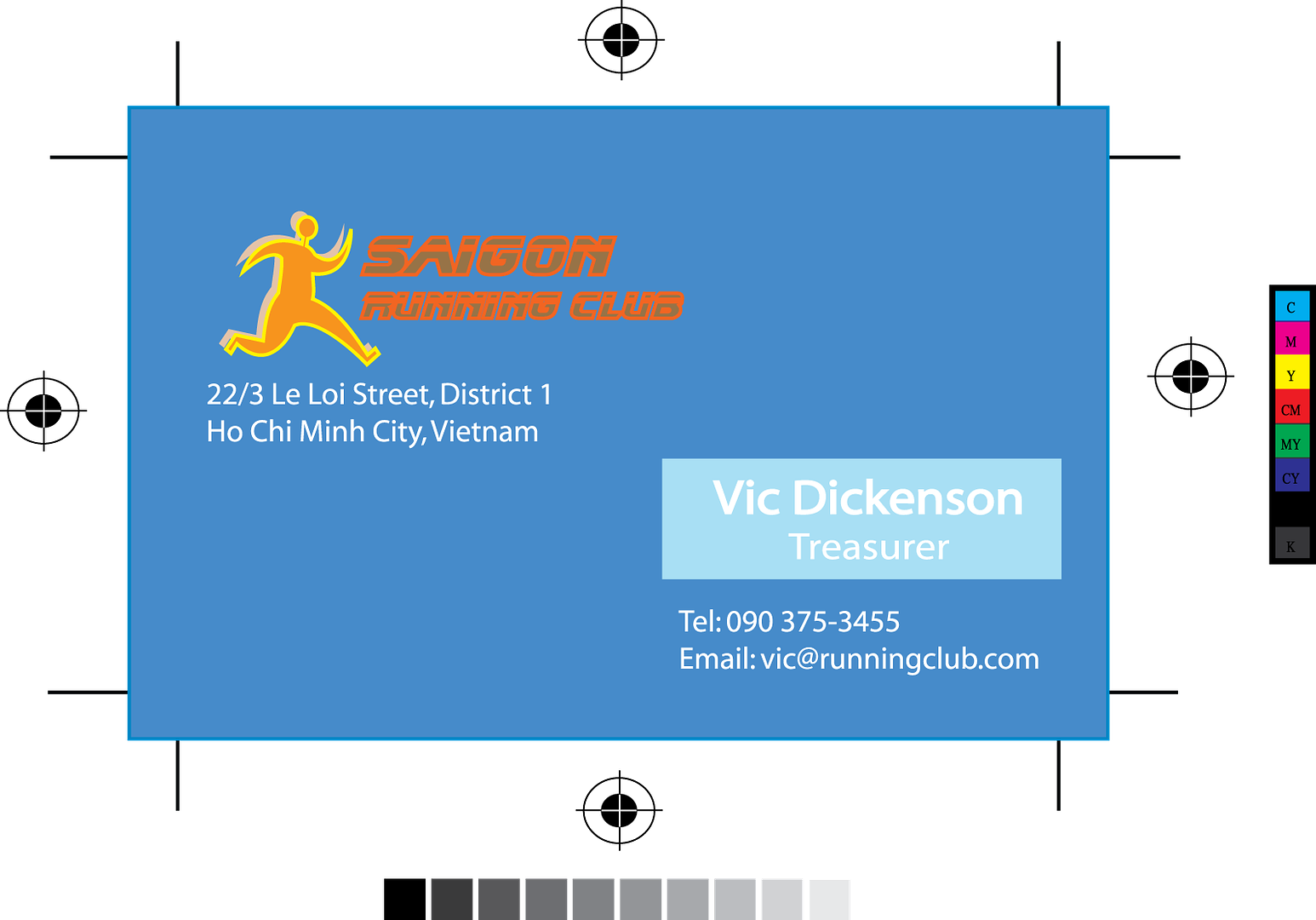
First is the business card I designed for Vic Dickenson who is the treasurer of "Saigon Running Club" (hope so ^^) I chose blue color for the background to create a feeling of trustworthy and carefulness. I changed the color of the logo a little bit to make it more dynamic and lively and fix the main purpose of Running Club. And well... dont know why I always choose Myriad font for such formal situations like this. Whatever it is, just enjoy it and feel free to comment ^^

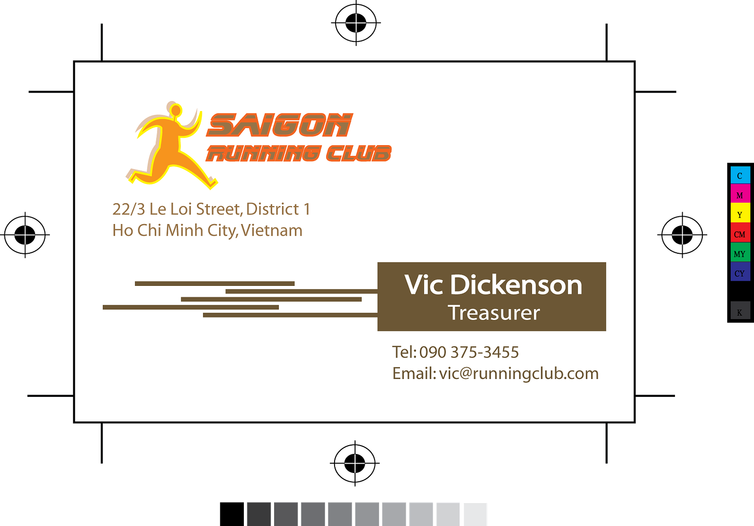
The second card is just my sudden inspiration after taking an afternoon nap ^^. I chose brown color to create a sense of stability, white color to build a sense of explicitness, etc. I put several lines to reduce the spaciousness as well as make people feel something straightforward :) That's what I think... how about you?

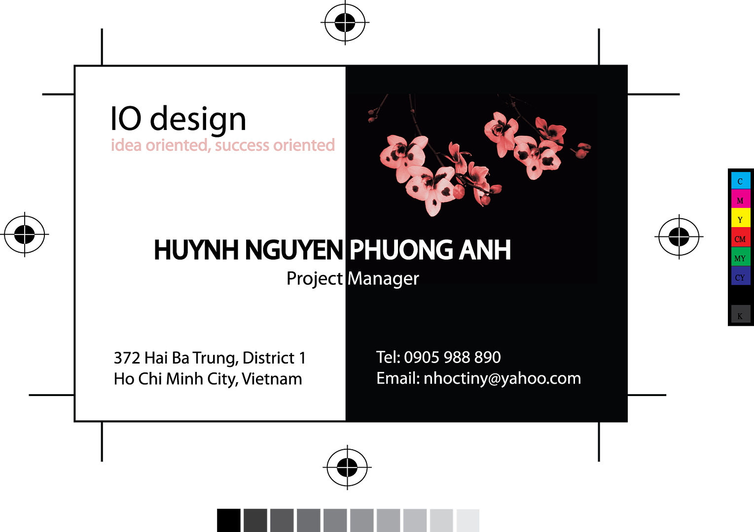
The next one is the business card for my own =.= Though I couldn't read the slices, I knew that it was somehow different from what I was told to do +_+ I thought that if I just put some available suff on the card and change the font Myriad a little bit, it'd look like thousands cards on others' blogs. So I made it different from the directions in the slices. However, I do like this card. Lily, plz forgive me :)
Guys, you may wonder why I chose "IO design" for my company name. What to say, that's my friend's company name and its slogan is "Idea oriented, Success oriented"...


9 Comments:
For these three cards,i can partlr realise your style dear; dynamic,active and kinda modern are main components you expect in your dsign (>_<) am i right?
However,for the first 2 cards, they do not impress me much as the third one. Yeah,i like the third one...
Sunday, July 30, 2006 4:45:00 PM
Thanks Dung ^^
I myself like the 3rd one best. You're right when saying that I concentrate on modern and dynamic pieces.
Sunday, July 30, 2006 4:50:00 PM
tee-hee that's the 3rd card, sis ^^
whatever it's, I love to hear that you like them :) That will encourage me in my next works so much! Thanks!
Sunday, July 30, 2006 10:20:00 PM
ummm, i like the third best, just like Dung ^^, the first two cards are a bit plain and simple in compared to the meaning or the intention of the club. It's a "running club" so i guess i prefer something dynamic, not so stable. But I like the font u chose for the text "Saigon Running Club". It looks nice and does connote a sense of speed in there ^^ Well done! =]
Monday, July 31, 2006 5:03:00 PM
HI
really impresssive and wonderful
I like your desinging.
WEll done
Monday, July 31, 2006 5:18:00 PM
@ Thanh: I understand what you mean, but this card is made for Vic who is a treasurer. Therefore, I want something stable and straightforward, not something very dynamic and lively ^^
However, I will pay attention to your comment. Thanks :)
@ Bee: thanks, sis ^^
Monday, July 31, 2006 6:24:00 PM
I really like your pictures, it's very interesting and creative. I like the 2nd best because of its brown lines.
However, I think your texts are a bit jaggy, it possibly becauses of your font. And another thing is your e-mail sounds not so professional for a project manager ^.^
Tuesday, August 01, 2006 9:16:00 AM
The first card, I like your use of complementary colors blue and orange. There is good contrast between the man running and the background. Thing that does not work on this card though is the font color of "Saigon running club". It would stand out more against the blue if it were lighter, posibble yellow or white to match other elements on card. The blue box around the manager's name is a great idea to focus attention,b ut then there is not enough contrast between the light blue and the white.
This second card is a little bit better in terms of contrast between the background and the forground. Those lines are great. Yet again the font and color choice for "Saigon Running Club" not so great.
The last card is lovely. My only change is to make "idea orientated, success orientated" one of the darker pinks that is reflected in the flowers. It'll "pop" instead of being so subtle.
Tuesday, August 01, 2006 3:02:00 PM
@ Lily and Phong: thanks so much for your both comment ^^
I'll try more in the next works.
Tuesday, August 01, 2006 7:41:00 PM
Post a Comment
<< Home