c.O.m.p.O.s.i.T.I.o.n. >>>
Hey guys...
Let's see some works of my Compostion collection ^.^
As we all know, Composition in Design refers to the arrangement of the elements of of art in a work. It's really important because it helps to communicate the feelings and ideas of the artists with the viewers. The 1st and 2nd picture were inspired from the Rhythm concept which let create a layout having the same elements with various repetitions. However, after finishing them, I found that they were a mix-up of Rhythm and Coherence principle =.=
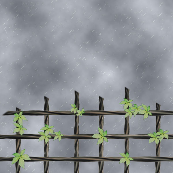
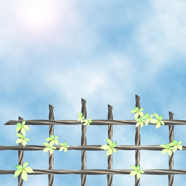
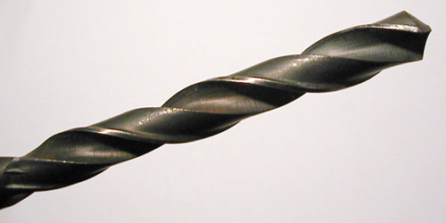
The interesting thing of these two picture is the fence was created based on a simple drill bit :)
This is the origin:
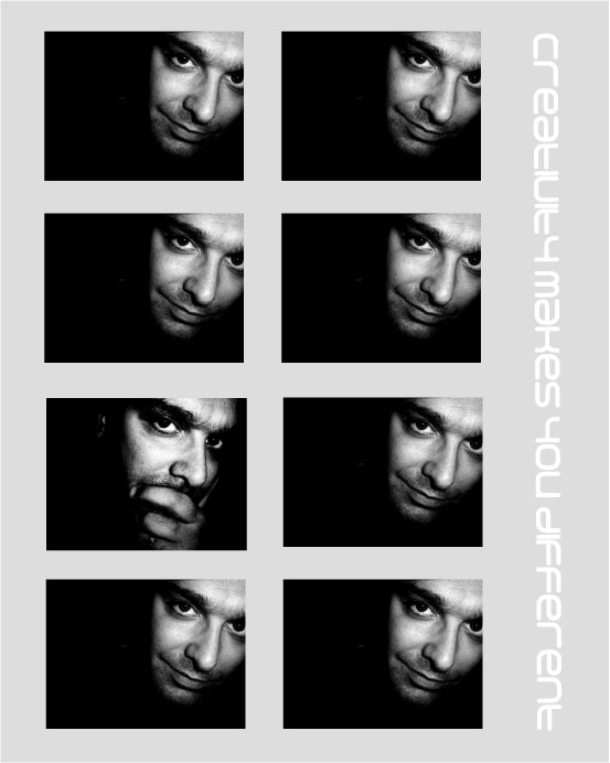
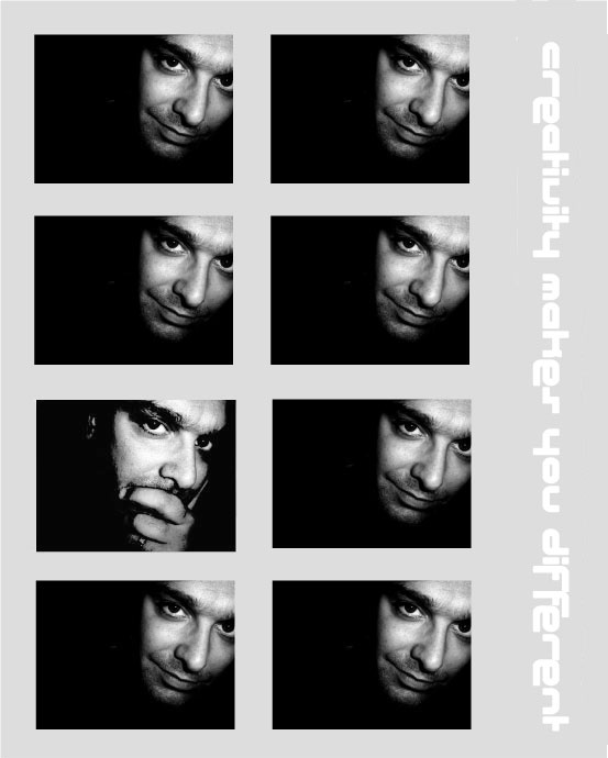
I love the next picture most ^.^ as it's meaning is what we, designers-to-be, want to reach in every work we make and every thought we have... That's "Creativity makes you different"... It refers to Dominance principle which allows to build a special element and make it different from others. I have 2 versions... since typoraphy is very important to make a picture more attractive and meaningful... Which one do you like best? Tell me, guys :)
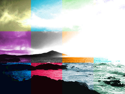
And the last one is a sudden inspiration. I don't know which kind of compostion it belongs to. I just made it because I thought it'd be pretty weird and interesting to view. This comes from what I think about the world reacting upon our thought and feeling. The world's reactions depend on what we're thinking, feeling and doing. If we felt happy or peaceful, maybe the life would be colorised by pink or blue... but if we felt sad or despressed, its color would be grey and dark... besides, if we were stress and angry, it would change into red or something like that... Although life is hard as it can be seen, why not just enjoy our lives and try our best? My message through this picture is "Life depends on what we are"
One of my friend think that it is fairly colourful, but I felt it's the matter which mostly attracts people . Maybe they would think it's beautiful and interesting, some might consider it as a stupid and funny work... Whatever, just ENJOY it and COMMENT plzzzz.... ^.^
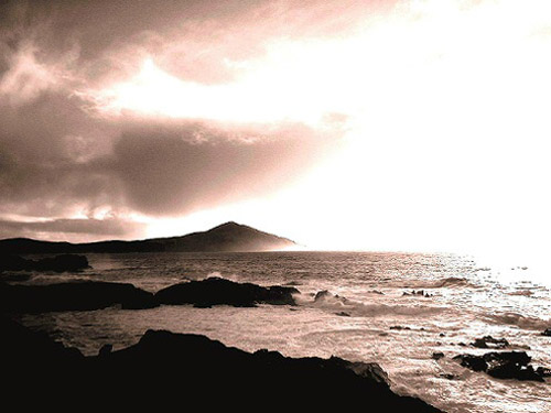
The original one only makes people feel sad or something like that, rite?
posted by Alan Vo at 9:50 AM
![]()
![]()


18 Comments:
Wow! using a drill to make a fence is an interesting idea! Well, the color is cool, but if you make a little change 'bout shape, light,... to make it like 3D, it would b more real and attractive!
'bout the last one, I think it some like proportion, but i'm not sure! ^.^
Great work! Keep it up!
Sunday, July 09, 2006 8:07:00 PM
Well, I love the first two pix best because it's lovely and kinda relating to my mood right now...bored and unclear. I must say that ur photoshop skill is improved day by day!!! ^^ so keep it up!
Sunday, July 09, 2006 8:53:00 PM
@ Mel: thanks babe.. you know, I've just learned Photoshop for a few days.. what I can show now is what my best can do ^.^ actually I wanna make it 3D, but I dont have too many necessary skills for that :(
@ Thanh: haha do these two pics look so bored and unclear like your mood rite now, gal? =))
Sunday, July 09, 2006 9:02:00 PM
Thanks gal.. the technique used to create these two pics is quietly simple.. you can meet me outside, I'll show you^^
Sunday, July 09, 2006 10:26:00 PM
Your art has a very fun rush to it. Your eye for lineage is very nice.
Daniel
Monday, July 10, 2006 1:47:00 AM
The first 2 pics: the difference between them is the sky. Thay said, depend on your feeling should the evironment change! And I feel like I love the "raining" one better. It's a comfortable feeling. Moreover, the dark background of the "raining sky" makes the fence blend in and look more real, hehe. You should work more on the fence if you wanna convince the audience about it.
About the next two pics: the bold-font one looks more... difficult to read, hehe. And I like the way you liquidfy (don't know if I remember correctly) his face. But were I you, I would let it be the right face, not the left one like you did, don't know why, just because, hehe.
And last: to tell the truth, I don't like the two of them. Kinda weird when you modify the pic like that, especially when the pic has the bright portion, on the upper right. It would ruin your intention to color up the original.
But way to go girl. Show me the best you can do, bwahahaha!!!
Nghi Nguyen.
Monday, July 10, 2006 8:53:00 AM
This comment has been removed by a blog administrator.
Monday, July 10, 2006 9:13:00 AM
sorry guys.. my litle brother has cleared my comment :(
@ Henry: yep.. our feeling affects the environment :) the same scene, but different situations
@ Daniel: nice to know that you're interested in my works, guy ^.^ actually I don't want all of my works to be linear :) anyway, I like your comment
@ Nghi Nguyen: you should syudy art, man! Your experience about art is great!
About the 1st and 2nd pics: you can say what I'm thinking.. so GREAT.. but u know, I've lately approached Photoshop so my skill is not so strong :(
About the other pics: do you know about proportion and placement in composition? I didn't photograph them but I think they rely on what is called proportion. It makes people take more attention on the pic.. ^.^
Try it somehow and feel the difference, guy
Monday, July 10, 2006 9:26:00 AM
actually, i dont understand much about design as well as photoshop. however, those pixs r so kool,i like the blue one ^o^
khoa
Monday, July 10, 2006 9:41:00 AM
Thanks Khoa ^.^
your comment cheers me up
Monday, July 10, 2006 9:43:00 AM
Hehe yeah, my experience in art is great... and I don't even know what Picasso tried to say in his paintings, hehe. It's just my feeling that told me so *_* People say, great minds always meet each other, you and me, sis, *_*
Monday, July 10, 2006 10:09:00 AM
Thanks bro.. have nothing to say =.=
Monday, July 10, 2006 10:12:00 AM
very well said.
the first 2 pix: the difference between them is the sky. i don't really like that blue sky. it looks too.....bright and i don't think it's a good match for a blue sky with a metal fence. the other one is the one with the dark sky and it is raining. i like that pix. because it looks more real than the other one. since the sky is gray and dark, it created something, something that is unknown and need to be discovered which is a really good picture.
the next 2 pix: the first one is much better. the text is not bolded like the 2nd which is easy to read.
the last 2 pix: u know what? i totally have no idea why would u put all the color into the first one and made it looks like a ......... i dont know. it's just not the way i like it. but the 2nd one is AWESOME!!! i like it a lot
Monday, July 10, 2006 10:17:00 AM
Thanks Tuanh,
- About the 1st and 2nd ones: if I hadn't showed the original pic, would have you known the fence is made from a drill bit? Maybe yes.. maybe not :) Just because I have to choose one of provided pics, therefore my source is partly limited ^.^
- About 2 next pics: I use 2 different fonts, gal. Just take a clear look at them :D
- About 2 last ones: hee-haw, I said that maybe you would like it or not, rite? Just make it for fun ^.^ By the way, I didn't photograph the last pic =)) but I must admit that it's so beautiful, gal :-x
Monday, July 10, 2006 10:28:00 AM
well, I got some suggestions. About the first 2 pix, it's great (already said abt that ^^) for the second pic, the idea is cool, however the text is a bit difficult to read, if you can make it a bit simple, it may be better! About the final pic, I love the colors you "painted" and how you put them next to each other...it's interesting to look at ^^ but I wish t he propotionality among those square was different (eh, you know what I mean?) By that, it may look more natural and randomed (excuse me if this word is not correct *_*). That's all those tiny things you may want to fix...Overall, your work is super ok! ^^
Monday, July 10, 2006 8:20:00 PM
@ Thanh: thanks gal.. maybe I'll try then.. but you know we have 2 or 3 tests this week.. so hard to arrange everything smoothly :)
@ DarkBlack: I know that you do love my litle cute leaves =)) thanks, gal
Monday, July 10, 2006 9:56:00 PM
You've established a nice rhtym in the placement of the flowers and I like how you''ve played with the mood by adjusting the sky in the first two images.
The second set of images illustrating dominance is very similiar to examples in class. Although effective, I liked you to challenge yourself more and explore other ways dominance might be achieved. The typography in the first image is clearer to read.
The last image is playful.
Tuesday, July 11, 2006 1:51:00 AM
I'm quite impressed by the way come up with the idea of fence and flowers. It's a contrast between hardness and softness. Lovely delicate flowers supported by a stable fence are like female beauty in the protection of male strength. A very good pic! But what if you could make it more interesting as, I think, it's a little simple.
Friday, July 14, 2006 12:28:00 AM
Post a Comment
<< Home