O.o Typography Exercise o.O
Hi guys, it was a very very busy weekend, rite? However, let's forget about some frightened assignments and enjoy ourselves viewing my new stuff ;))
These images may look bad at your computer, so please try to click on them and zoom in to view the precise quality and images ^.^
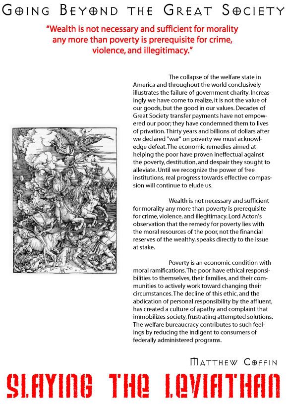
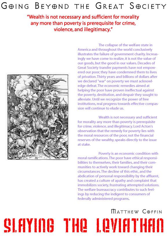
The first and second picture were based on an article about "Slaying the Leviathan". That was an awful and cruel massacre, therefore I used Weltron Urban and Avalon Quest font to depict the wicked and dictatorial conquerors who commanded to kill the Leviathan. I think they're both somehow good at their task. Besides that, I used the black and red color to impress the hard time and harsh survival that the Laviathan experienced. The purple text was just a sudden inspiration since I always think that purple color stands for the sadness and fearfulness.
The 2nd verson:
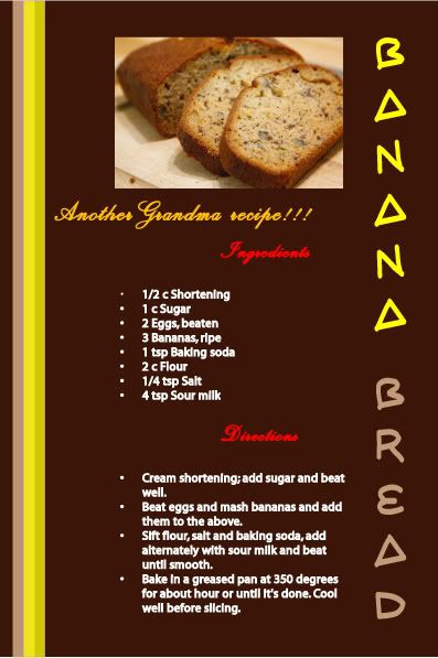
The next exercise was to create a layout of a formular directing how to cook banana bread at home. Because it was involved in food and fruit, I wanted to make something sweeter and warmer. I took the color of the bread by Eyedropper Tool to colour the background and the word "Bread". I tried to color the text "Another Granma recipe!" with the color that seemed to be the color of bee's honey. That would make this smooth and soft like a stream of bee's honey. The word "Ingredients" and "Directions" were colorized with the Red one which is considered the color of the heating's fire at home. Besides that, I decided to use Script font for some texts to make things look like home-made. Hopefully, it would make people feel more interested in my stuff.
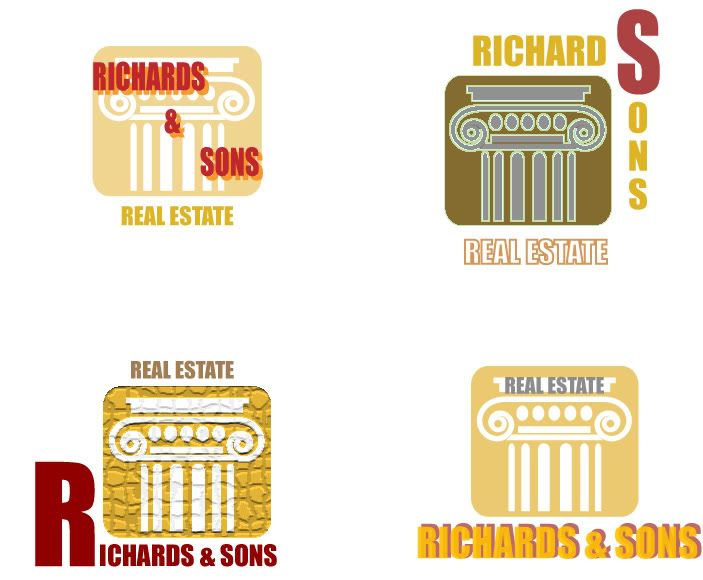
The last one is a picture of four logos designed completely by Illustrator. I was somehow pleased with this work. Don't know what I can tell you more about these logos (either don't know whether the word "logos" is correct). However, just enjoy them and feel free to comment. I do need yours.
posted by Alan Vo at 12:56 AM
![]()
![]()


2 Comments:
I like the font that you use for the title. Where did you download it? And I think the first version is better because purple and red .uhm... they seem don't match together.
Tuesday, July 25, 2006 8:49:00 AM
Thanks... ^.^
I just dont remember where I downloaded it but I can send to you at home.
I also the black one better :D
As to the purple one, I know why you thought that they didn't match each other... that's because the purple color is kind of bright and fresh :)
Tuesday, July 25, 2006 1:50:00 PM
Post a Comment
<< Home