Ads that I like ^^
I took a book in library and found many interesting ads on that book... now I want to introduce you guys some of them ^^

That is poster designed by Luba Lukova Studio for AIGA Orlando to encourage people to avoid war and love peace. In many other designs, we can easily see that are only postive spaces which are used effectively. The negative space is sometimes the background or things that are not really important. However, in this composition, both active and nagative forms act actively within a symmetric structure. Commonly, the black background, in other works, serves as a negative space and does nothing with the whole thing. But in this poster, it doesn't only act as a backdrop between the characters, but also the nuclear cloud. Therefore, both postive and positive shapes can actively forces viewers to look and consider the whole design carefully.
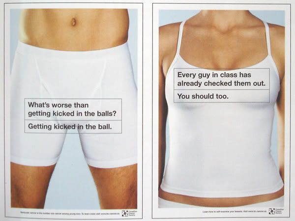
These two posters are produced by Rethink Advertising/Vancouver for Canadian Cancer Society. First, I like them since the whole designs are neat and clean, the font is readable but catchs attention due to its simplicity. Moreover, the messages are enclosed and focused clearly on the aimed parts of the body. They are both extremely good examples of posters which give a reasonable rationale to turn consumers into believers. They show the pictures of a girl's breast and a boy's underneath as well as the messages of why people should have check-ups. These designs also use humour to establish their idea so that they are much more impressive and memorable than other common ads that encourage people to check their health regularly.
Reference:
Landa, R. (2004), Advertising by Design, New Jersey, John Wiley & Sons, Inc.
posted by Alan Vo at 4:13 PM
![]()
![]()


0 Comments:
Post a Comment
<< Home