Second layout for Website Construction
Since I had to make 3 differents mock ups for that course, I had to run with the time to complete the whole thing -.-
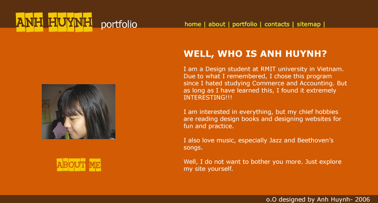
This is my second layout. For this website, I use a modern and simple style. It is only the main title 'Anh Huynh' which is used a graphic pont, the rest is Vernada font. I do like this font due to its readibility and simplicity. The orange and brown color are used to present something stable and trustworthy since I want my potential customers will have that feeling when looking at this site. The navigation is kind of plain due to its whole main theme.


1 Comments:
Very nice layouts - the orange is particularly nice - so strong and clean - lots of impact.
Tuesday, November 28, 2006 11:34:00 AM
Post a Comment
<< Home