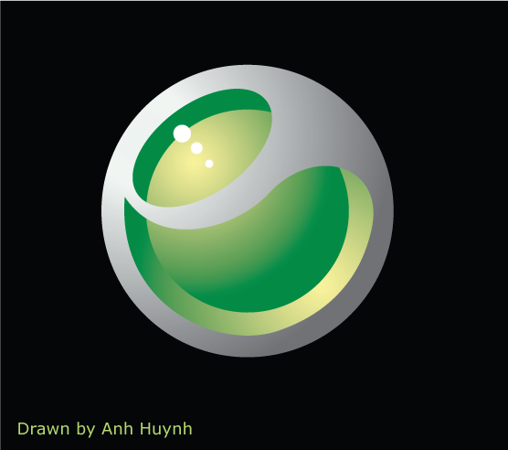
Logo Sony Ericssion drawn by me :D
I always think that I sux at Illustrator, but after creating a social welfare poster, I wanted to try something new on Illustrator. So I chose the logo of Sony Ericssion to re-draw. The reason I picked that is the logo of Sony Ericssion appears everywhere, on the street, on the Internet, on my phone cover, etc. So I can easily look at this and re-draw.
Believe me or not, it's not hard at all when drawing things on Illustrator ;) I just made 4 layers for this logo. The 1st layer is the largest circle with radial gradient, while the 2nd smaller circle has an opposite radial gradient. The 3rd layer is the hardest one, I tried to draw by pen tool for several times then use the "Compound Path" option. Three little white cirles which are on the 4nd layer are the easiest thing to draw =]
posted by Alan Vo at 7:04 PM
![]()
![]()


1 Comments:
W>O>W
Well done. You obviously have a really good handle on how to get depth and height out of light in Illustrator,
Want to give a little presentation on how you went about doing this :-)???
Tuesday, December 19, 2006 3:24:00 PM
Post a Comment
<< Home