2 color graphics
2 color design is a way to be creative interestingly as well as to save money. As many design companies have to face a client's request to design on a small budget, the resolution of making it in two colors or else is creative, powerful and economical. In other cases, it doesn't mean that the company has budget restriction, but it may be due to the age-old original style of that firm.
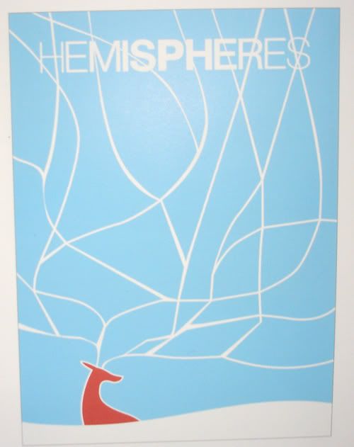
For example, in this United Airlines Hemispheres Magazine cover in December, two main colors are blue and brown. The white color serves as a minimal part to express the elegance as well as the color of snow and coldness of the winter.
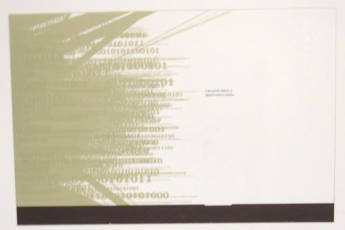
This is Seagate Print Advertising. In this ad, black and mettalic spot green are used to be the main colors while the white background acts as the third color. The metallic color is employed to stress Seagate's corporate colors and build the illusion of depth.
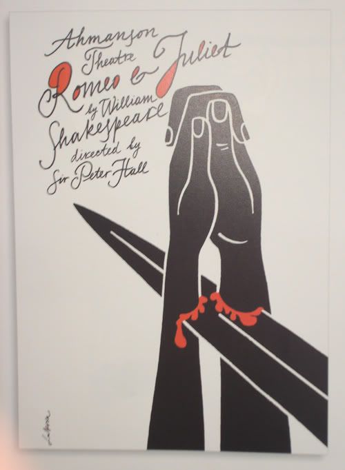
This poster is designed for Ahmanson Theatre by Luba Lukova studio. It is easily seen that there are two main colors: red and black. Like the previous one that I introduced, the white background is the third color to emphasize the black shapes of the hand and the sword, as well as the red shapes of blood.
However, I think the typography kind of distracts the whole thing. The idea of using the script font is good but to me, the handwritten text like that makes the poster more messy and fussy.
Reference:
Templin Brink Design (2004), 2 color graphics, America, Rockport Publishers, Inc.
I took all of the pictures, so the quality is not so good. You can take a clearer look at the actual book in the library.
posted by Alan Vo at 9:14 AM
![]()
![]()


0 Comments:
Post a Comment
<< Home